Friday, June 22, 2012

Colors choices- getting down to the finally selections

So we have paint selected for the walls and we are doing stained concrete in the bedrooms for modern look. We just want to pick one color of stain for the floors. Here is the palette of floors colors we are choosing from today.
Patrick is traveling in Canada on business, so I am emailing him images of the floor samples and paint samples on the walls to make a decision for the final combination. It is definitely different working with a partner to select finishes. This is new for both of us. 

Our floor has gotten filthy, this week, with the sheetrock from removing the popcorn ceiling and adding some mud to the ceiling to create a smoother texture. Now our concrete floors look more white than gray. We have 5 shades of color to choose from. These stains are translucent so you will see some of the marks through the stain. Marks that will be seen are patching from the nails holes, swirly pattern of glue, cracks and what have you. 

So tomorrow the concrete guys come back and sand down the concrete floors a bit to clean the surface and prep for staining. Things are really going to get messy. The shade of color I think we want to go with is the dark brown above, it is the darkest shade. It has a slightly purple undertone to it. A few of the other colors had too much of a yellow tone to them. Which are fine but were not going to work with the more blue green color we have selected for the middle bedroom- we are going to dilute the intensity of this color for this room. And the light blue shade is for our master bedroom which will also have the brown concrete stained floors. The plastic bag in the photos is masking our ceiling fan since the ceilings were being redone. By monday we should have the walls painted!!!

This weekend we get to have a little demolition party on a brick wall and some landscaping outside back bedroom. It was the one with the train shelf in it. We are installing a new sliding door to the patio in it. The doors arrive next week, so in preparation we need to prepare by removing an ugly brick planter. I have never demolished a brick wall before so this should prove interesting. I am frankly not sure we have the right tools for the job. Can a sledge hammer and crow bar work? Or do we need concrete saws, jack hammer and heavy equipment to get the job done? We shall see on Saturday morning. Aren't you just looking forward to the weekend? 

Thursday, June 21, 2012

We are making a little progress.....

Here are some photos from the second bathroom in the house.
The first shot is the in progress shot (below), wall are primed waiting for paint.
The next shot is from today. We have the walls painted a nice shade of yellow. We picked this shade to tone down the green tile in the bath tub.

More photos will be posted tomorrow, I need to go meet the concrete stain floor guy in a few minutes to see what that is going to look like in the bedrooms. I think we are just getting anxiously to finally move into our home. Which we are planning on doing this coming Wednesday- so we have lots of little things to finish up prior to that date. 

Friday, June 15, 2012

ok, here are some not so pretty photos

Here is a brief video of one of the bedrooms in the home. It shows the nasty, smelly carpet and all the 'accents' that came with the home when we purchased it.

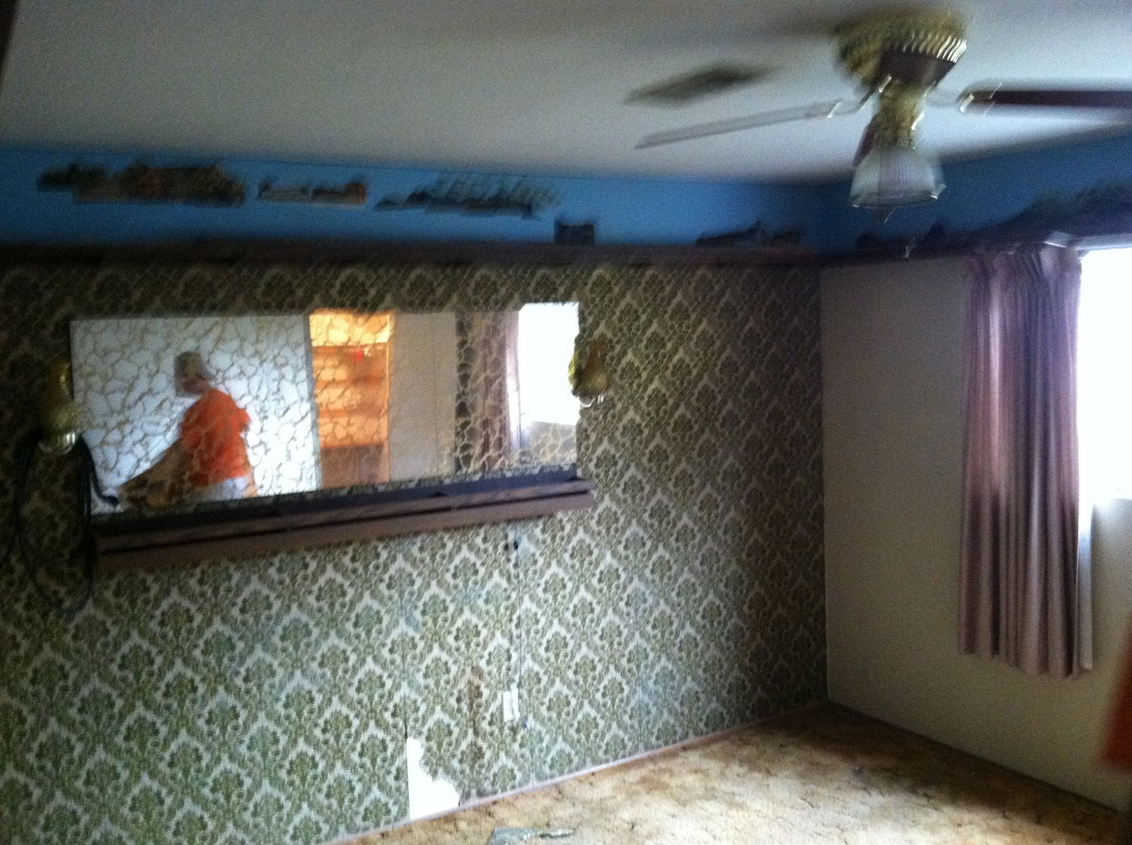
Here are photos for those of you who can't view the video. These photos are from one of our three bedrooms. It is the back bedroom that borders the backyard. Eventually it will be a master bedroom for us. 

Anyway, what you will see is really dated, worn, goldfish colored carpet. It was so worn when we removed the padding, the padding was seriously adhered to the concrete floor. 

Working our way from ceiling to floor, it is a popcorn ceiling and then you start by seeing this 'lovely' blue border. It was 1/4" particle board with blue wall paper that was attached to the wall to add a scene to the brown shelf just below it where a train ran around the room. 

Yes, I know what you are thinking. Oh how cute for a little boys room. No, this was the office and not a child's room in the house. What you will also notice is a few other things. 1. Lots of random cables and wires running every which way. 2. Two strange pieces of balsa wood attached to the door (covered up a hole by previous owner- this was their 'fix'). 3. Access doors to plumbing- it is the little door on the left hand side. 


Here is the other wall- which got even better. I know your thinking- really it gets better?!

The photo above is contains an eclectic color palate with pink curtains, velvet green wall paper, the blue scenery, mirrored wall, with groovy green lights. 

 Here is a photo from two days ago- trying to remove the wall paper. It looks a ton brighter in this room with out the brown train shelf. And the carpet and security bars on the windows are gone. Removing the security bars turned out to be quite the hassle. They are installed with one way screws. So you need a special tool to remove them. We didn't like the look and frankly I would have died in a fire if I had to get out a window with these devices. There is a safety release but could never get it to work for me. We are thinking about doing stained concrete but can't decide on the finished look. Let me know if you anyone has any advice on stained concrete.
Next week I will show more in progress photos......... To Be Continued!


Friday, June 8, 2012

We got keys today on our house!

Projects are starting tomorrow. Oh, and as a little advice. Prior to starting any projects on your house, highly advise not to get yourself injured. I took a little spill on my bike while riding with a group last weekend. I think in the doctor's visit- I was asked, "are you trying to get out of moving and our construction project?" As if it was that easy......

We decided to work on the space we will use the most- the inside. Our plan is to remove the window and door bars from the outside. Scrap up the smelly old carpets, have a cleaning crew disinfect the place as it stinks like dog.

Then in about a week, repaint. Repaint the inside something calm and soothing. We are looking at gray tones with blues mixed in. The current colors are dark green and reds- it is simply too much for the size of the space. It has a dark cavernous feeling, so we hope to change that by adding some more light and using brighter lighter shades of subdued color.


Love the light blue color in this room, but our floors are darker. Eventually they will be a stained concrete.
gasl_fabricpalette_06mar_02


This is the color of the floor in our living and kitchen space- imagine the walls a light blue gray shade.
4-coastal-chic-foyer-kitchen-dec0707_xlg


Thursday, May 31, 2012

Keeping your chi


Interesting article I found. It makes you think about design in a different way especially if you are ever designing for an asian client. 


I worked on this project in the middle east, while leaving in New York. The project was a new college called the American University in Afghanistan. And it turns out that toilets and urinals can not face toward mecca. So this caused us to redesign the floor plans. Our next question was which direction is mecca?


So designing to cultural sensitivities is important to keep in mind. 


Excerpted from the ocregister.com:
Ms. Feng Shui walks into a model home in Irvine and glances around the room.
“You want the front door to be solid, not glass,” she says, eyeing the position and color of the door, examining the stairs, checking out the bathroom and inspecting the picture frames.
A window in the front door, “it’s like a hole in your mouth,” she says.
Front doors should be blue (for water) or black (representing career).  And it should never be in alignment with the back door because “all the energy goes out the back.”
Stairs should turn sideways to the front, also to keep the home’s energy from rushing outside. A home’s energy, or chi, should linger.
“A home should be a place where you recharge,” she says. “It should be restful.”
Ms. Feng Shui — a.k.a., Hyun Jung “Jessie” Kim of Lake Forest – doesn’t just advise homeowners. Lately, she’s been hired by KB Home to advise its designers on two upcoming developments, Sage at Portola Springs and Garden Hill at Portola Springs.
Many of feng shui’s values are common sense.
For example, both Wong and Kim noted that it’s bad feng shui to place homes at the top of a T intersection, with car lights flooding into a home’s front windows. But that’s just plain bad from any standpoint.  Red front doors reflect bad energy for homes at the end of a road or alley that form a T intersection.
Other things are not so obvious.
Kim explained that the sink and the stove top in the kitchen can’t be aligned because water and fire shouldn’t be together.
Also, you don’t want family pictures framed in metal in the family area of the home because metal cuts wood.  “That’s considered the destructive cycle,” she explained.
Ceiling fans above beds are bad because they deflect energy away from you, she said.
Feng shui devotees like the number eight in an address – or numbers that add up to eight – because the word for eight sounds like “wealth” in Chinese and is good for money.
If a home has an unlucky address, the address can be “changed” by adding a hidden number or painting an invisible number on the wall using clear paint or the same color paint.
If an address can’t be changed, Wong advises builders to put a less popular model on that lot, saving the most popular models for lots with favorable addresses. It’s likely the lot with the unpopular address will sell to a non-Asian buyer “who doesn’t know it’s a bad number,” she said.

Monday, May 21, 2012

While I love texture, this just isn't working.

 The first image was from our house hunting trips a few weeks ago now. This house had a dark brown clay tiled roof, 2x2 white wall tile on the eaves and 12x12 white tile around the baseboard of the house. It had too much variety with the texture and lines all working in many ways against each other. So there is too much of good thing for sure going on.
This next photo was from an entirely different house. We had labeled this the adult party house- with its pool room, full bar, oddly arranged kitchen and rooms with multiple doors. There were a number of things wrong with this house. (Earlier that day we had visited the college student party house so this was the adult version.) But for whatever reason I took this photo of the river rock detailing. A person could successfully use river rock but your design should be cohesive but also not excessive like what we saw with the too much texture post below. The river rock cabin feel could have been brought in with some rough sawn timbers used in the ceiling or some detail wood working here and there. What a strikes you? Leave comments below.

Friday, May 11, 2012

How MUCH? & fugly


This was a conversation that we have been having as we realize our house project is going to need some work. We are closing on our home in less than 30 days from today so the clock has started ticking. 

So now we need to figure out what tools we want to use, get finalized estimates for work, and get all that work scheduled that needs to be done before we move into our new home which is less than 45 days from today. We have 14 days of a window for some of the construction work to get done.

I think we are anxious to get started but also need a little distraction from the house for a bit. So I decided to do a google search on google for 'bad architecture.' Here are a few of the eye sores I found. Which one is your favorite of the worst?

Option 1: three tall, colorful men

Option 2: concrete monster

Option 3:  deviled egg
(Option 1)
The Mr. Fu, Mr. Lu, and Mr. Shou Hotel…is about 40 min east of Beijing, close enough to be considered the suburbs. It is situated in the rear of a concrete housing development, which are situated beside two active nuclear turbines. The building itself is constructed of concrete and colored tile. It is a hotel, and you can rent the room that looks like the jack-o-lantern!”  (direct quote from http://www.christopherdgray.co.uk/2004/09/badjianzhu-bad-architecture-beijing/)

(Option 2)The concrete monster initially looks to be a jail or some sort of institution. Well, it turns out to be the Nate Holden Performing Arts Center on 4718 W. Washington Blvd....... some things are not what you expect them to be. 

(Option 3) The Indian Pavilion and Saudi Arabia Pavilion at the Shanghai World Expo 2010

I heard a new term today for bad architecture: fugly. My vote is for option 3 is the best of the worst. Now I can only guess as to much money was spent on these projects. Unfortunately this was a bad investment in my mind.