Monday, January 25, 2016

Stained concrete floors- lessons learned.

These are two of the before shots from the master bedroom. The walls were painted from these dark and awful shades of green that didn't compliment each other. The nasty carpets from the 70's were torn out. Unfortunately the padding was matted to the floor. This door leads to the master bathroomThis door is entry to this master bedroom. Once again ugly floors, walls and popcorn ceilings. 

But today we are focusing on the stained concrete floors. The photo on the left is sample of the desire color- called hickory a natural acrylic stain. 


Here is a photo from what the floors currently looked like. Initially, we were really pleased with the result. This photo shows an area where we had some problems with the color curing properly. The concrete was sanded, stained and then sealed. The top coat sealer didn't dry in a few places. I had been assured that the sealant was durable enough for a garage but it clearly didn't perform.


The other problem we had was the concrete staining guy didn't plan on his stain spray going up the walls. So we had to have the painter come back in to touch up stuff.


Thursday, May 23, 2013

House Front Yard Landscaping concept for Southern California Home. The front yard will use native and drought tolerant plantings. The modern, clean, cedar fence will be stained with variety of saturation of the same stain to get a variegated look to create more interest. The house address numbers are 2-3' in size and boldly claim the house.

House landscaping consults start at $200.

Birds on the wall

This painting was inspired by an image I had seen of a bird. As I was painting suddenly there were two birds and few stars painted off in the distance. Artwork has a surprising even the artist sometimes. This painting looks great with my lightly colored blue walls. This painting is for sale by myself, Vanessa V Hofmann for $1500

This piece has been reworked and has recently been admitted into a great art show in Balboa Park, with museum of the living man.....Super excited about this!

Friday, February 1, 2013

New art and art show

Recently I had the chance to have my art displayed at this fabulous woman owned bike shop, HERevolution, in San Diego, California specifically Solana Beach are really hip, artistic area. With this upcoming show, I had to create some new pieces of art work. I wanted to share a few recent additions and celebrate another sale of an art piece.

Here is one of the recent additions:
This one is called bright orange tricycle. It is a 12"x12" mixed media art piece on display at the bike shop. We are having a little one in mid March so that was the inspiration for this piece.

Another recent addition of artwork is this painting, and even better is that it sold yesterday. Yippee!  It's called green bike and the star fish. It is a 10"x10" piece on canvas and is also mixed media work. 

Mixed media means that it isn't solely one type of medium used (like just using only watercolor, acrylic or oil), but a mix. On my work I usually work in a few different tools. Mostly the painting is acrylic, with additions of pastel, oil bars, and charcoal.

Up next is solo show at the San Diego Art Department starting in February 16th more information to follow. Life seems to be happening in baby steps, but it feels quite appropriate right now.

Friday, January 25, 2013

Screening options inside and out

What are screens and how might we use them in design?

Here is an example of a modern visual screens:

If you want to add some interior detail to your home these are great. And they have a sale going on as well. I am trying to find some way to use them in my own home. The photo below shows a number of product that can add texture to your home or office space.

Office use of visual screen- screens are used to further define rooms in spaces. They work better than solid walls by allowing light to pass through. Thereby not making these smaller spaces feel to small, but feel comfortable. 

The other interesting space to add detail is in your backyard. Imagine a screen like this used around outdoor pergola to add additional screening options from the sun. Even more ideal is to put a screen like this on tracks kind of like doors so you can move them around.
Pergola

Here is a more modern pergola design.


An example of a screen integrated into the back porch of a home. Living in warmer climates like California you have the ability to enhance your outdoor spaces and your home by creating various outdoor rooms that are adaptable to the climate.
 
Here is the link to this company who is having the sale if you are interested.  I am not sure if their product can be used outside.

http://www.crestviewdoors.com/order/diy-kits-and-more/clearance.html

Header_Welcome

Wednesday, November 21, 2012

Here is an interview video from my friend Lee Mench. Take a look about how we work at Studio Plank on medical projects.

Hope everyone has a Happy Thanksgiving!

Monday, August 6, 2012

A mixture of emotions- but mostly joy.

Today I sold another painting!!! Happy happy joy joy. Each time it happens I feel a mixture of emotions. I am elated to have someone interested in purchasing an art piece but a little sad to see the piece leave. Each art piece is marking a time and place in thought and process of where I was. My artwork on bicycles simply take me back to each joyful bike ride we took as a kids with no particular place to be. When we just enjoyed being able to travel and explore. You know the rides with the wind in your hair, as your riding down the road in a skirt and sunshine on your face. Watching the wheels go round and round taking you on an adventure.

Today's bike painting is called "Blue Bike 3- Racing Delight". It is a acrylic painting of a whimsical blue road bike with a orange ballon attached to its seat. This painting was sold to a fellow San Diego artist, Nancy Plank.

This woman, Nancy, paints in the same art building that I do in San Diego art department. She happened to be passing by my work one day as I was painting away. And little did she know my head was filled with doubtful about what I was doing and why I was painting bikes. She walks offer and simply said to me. "I really love your work." And even her letter she wrote that my paintings were magnificent and that I am gifted artist...... who doesn't like to hear such great things. Knowing that the artwork will be so appreciated and loved by someone else and to see the new owner's enthusiasm is absolutely contagious and immediately the sadness disappears and excitement takes way.  
Blue Bike 3- Racing Delight by Vanessa Hofmann
It is actually very good that this painting was sold. Since it gives me more room to hang other work in our recently remodeled home. In a future post- I will take about hanging artwork and our latest steps in designing our interiors.


Thursday, July 19, 2012

Pick your artwork before you buy that sofa....

Foliage by Patricia Urquiola Branches and Leaves Contemporary Sofa Design: Foliage by Patricia Urquiola

Sofa- red, yellow, tan, black or white? Leather, corduroy, linen, wool.... Sofas come in so many choices in colors and fabrics.

As I am creating an art piece for our living room, which is composed of three separate canvases, I am surrounded by all our belongings.  Some of which are still in boxes in the house and in the garage. This home has recently been combined- all of my stuff and my husband's for the first time. We have many duplicates of several items. So as we pick through what items will remain to reflect a new combined style for us. Each piece brings elements of our own personality and combining them in the interior design is establishing a uniquely different look for us and honestly still a little ecletic. But I have the ability to create artwork that can combine the elements in the room together- it is like a super power in some way. Saving our room from disorder. Ok, I am just getting silly now. As I began this process, I began thinking about non-artists and how if you pick the art piece last it could be daunting to find the art piece to match your current selection of decor. So I began to think, why not pick the art piece first for a room? 

I am not saying it is impossible by any means, just requires a little more legwork when you are trying to buy an art piece. Sofas are abundant; they are everywhere. You watch tv there is an advertisement for sofas stores. They are in magazines and online. Now good artwork and good artists that fit your budget, and style needs are lot more difficult to find. Once you do find some artists really examine their work. How does it make you feel? Do you just love it? What does the piece say to you? Do you want to continue to look at or do you need to look away? Where is your eye drawn to in the piece?

Also keep in mind, you can request for an artist to create something custom for your home. But make sure you find similar looking styles and colors with in their body of work that has already been created. Don't expect the artist to create drastic changes from their existing body of work. They might try something drastic and they you might not love it either. 
Here is Phase 1 of this piece. I haven't created a series pieces or anything this large before. I have always seriously worked small. Even as a child in school, I would write in this teeny tiny print. So I am amazed that this is not intimidating but really fun. 

I am working with a light shade of lavender on the walls of this room. For color- think light gray and light purple blended together. I had actually started painting this in the art studio and was pleasantly surprised to see the colors matched the room. Once I am done I will share the finished piece with you. 

Feel free to share your sofa shopping stories, or combining household tips. 

Monday, July 2, 2012

Art- as the accent piece.


After only having moved all our belongings in this weekend, I am contemplating decorating of the interior space. The walls and ceiling are freshly painted in the living room, among many other changes throughout the house. The furniture is being arranged and rearranged, but the walls remain bare. We are taking this time to learn to live in our new home. Right now, I am focusing on getting the living room working. My theory is, some order is needed when you are surrounded by confused and unorganized state (of stacks of cardboard boxes filled with your possessions that you just got back from storage after almost a year) you should have one place that is ordered, even it is small space within a space. So we are focusing on one room- the living room. Now you might be wondering why I am not selecting another room like say the bedroom? Well, the bedroom floors aren't quite 100% yet so all the furniture is about a foot from the wall. It is livable at the moment but not ideal and that is an entirely different story.

Here is the before view of this room and the entrance to the house in this short video clip. As I watch this video again and again I keep noticing different things. The accent wall I want to add art to is a bold red wall in the before photos.


Here is 'in progress' shot of the living room's accent wall with its primed walls and a sample of the lavender painted on it. The plastic draping the wall is for protection when they were removing the popcorn ceiling. 

Here is an 'after' shot- showing the very light lavender color and brown toned wood floors. The wall I  will start with is what you see immediately when you enter the home. I want to do an eye catching art piece here, something really large but I not have any really large canvases at the moment and heck they are cumbersome if I want to take it to art class, nor do I have the free space in my garage while it is in progress.  So I am planning to do 2 or 3 24x48 size canvases and hang them all together. I haven't painted anything this large and never had to match it to a room, before so it feels a little daunting.

Today I found inspiration in the photo below, from a blog I read. This photo has a colorful mix of furniture, and motley of style of decorative elements along with the art piece it is a pleasing combination. The silver/ pewter mirror balances the some of the color found in the art piece and creating a harmonious room. My intent is to find a balance similar to this that will compliment our existing stained wood furniture and our existing decorative pieces.  


So besides blog- I find inspiration in this great group of women I paint with every thursday. One of the artists, Ann Golumbuk, I paint with has always painted art work for house. She says this way she gets a chance to enjoy it before it sells. And I absolutely love her work, and her joyful way of living- she is inspiring. She is one of the many people who inspire me. Here is a look at some of her pieces and a link to her website.

I am going to take a photo of her more recent work that isn't found on her website yet- it is really quite fun. She actually took first place in a local art show. Here is her website: http://anngolumbuk.com/


Another artist, I paint with is, Jan Lord. She is this wonderful, kind hearted Canadian who is very talented. Her work that I am currently interested in has these warm and wonderful beiges and with this sketchy images from arrows to fish in them. The sketchy images remind me of drawings found in caves. Here is one of her recent pieces that took 2nd place in the same local art show. http://janlord.net/  Jan is also on pinterist as well. http://pinterest.com/janlord/artsy/

I will keep you posted on the art piece that is created for this wall. I might even do a video on its creation. I just have to let the painting take me where it wants to go.


Friday, June 22, 2012

Colors choices- getting down to the finally selections

So we have paint selected for the walls and we are doing stained concrete in the bedrooms for modern look. We just want to pick one color of stain for the floors. Here is the palette of floors colors we are choosing from today.
Patrick is traveling in Canada on business, so I am emailing him images of the floor samples and paint samples on the walls to make a decision for the final combination. It is definitely different working with a partner to select finishes. This is new for both of us. 

Our floor has gotten filthy, this week, with the sheetrock from removing the popcorn ceiling and adding some mud to the ceiling to create a smoother texture. Now our concrete floors look more white than gray. We have 5 shades of color to choose from. These stains are translucent so you will see some of the marks through the stain. Marks that will be seen are patching from the nails holes, swirly pattern of glue, cracks and what have you. 

So tomorrow the concrete guys come back and sand down the concrete floors a bit to clean the surface and prep for staining. Things are really going to get messy. The shade of color I think we want to go with is the dark brown above, it is the darkest shade. It has a slightly purple undertone to it. A few of the other colors had too much of a yellow tone to them. Which are fine but were not going to work with the more blue green color we have selected for the middle bedroom- we are going to dilute the intensity of this color for this room. And the light blue shade is for our master bedroom which will also have the brown concrete stained floors. The plastic bag in the photos is masking our ceiling fan since the ceilings were being redone. By monday we should have the walls painted!!!

This weekend we get to have a little demolition party on a brick wall and some landscaping outside back bedroom. It was the one with the train shelf in it. We are installing a new sliding door to the patio in it. The doors arrive next week, so in preparation we need to prepare by removing an ugly brick planter. I have never demolished a brick wall before so this should prove interesting. I am frankly not sure we have the right tools for the job. Can a sledge hammer and crow bar work? Or do we need concrete saws, jack hammer and heavy equipment to get the job done? We shall see on Saturday morning. Aren't you just looking forward to the weekend? 

Thursday, June 21, 2012

We are making a little progress.....

Here are some photos from the second bathroom in the house.
The first shot is the in progress shot (below), wall are primed waiting for paint.
The next shot is from today. We have the walls painted a nice shade of yellow. We picked this shade to tone down the green tile in the bath tub.

More photos will be posted tomorrow, I need to go meet the concrete stain floor guy in a few minutes to see what that is going to look like in the bedrooms. I think we are just getting anxiously to finally move into our home. Which we are planning on doing this coming Wednesday- so we have lots of little things to finish up prior to that date. 

Friday, June 15, 2012

ok, here are some not so pretty photos

Here is a brief video of one of the bedrooms in the home. It shows the nasty, smelly carpet and all the 'accents' that came with the home when we purchased it.

Here are photos for those of you who can't view the video. These photos are from one of our three bedrooms. It is the back bedroom that borders the backyard. Eventually it will be a master bedroom for us. 

Anyway, what you will see is really dated, worn, goldfish colored carpet. It was so worn when we removed the padding, the padding was seriously adhered to the concrete floor. 

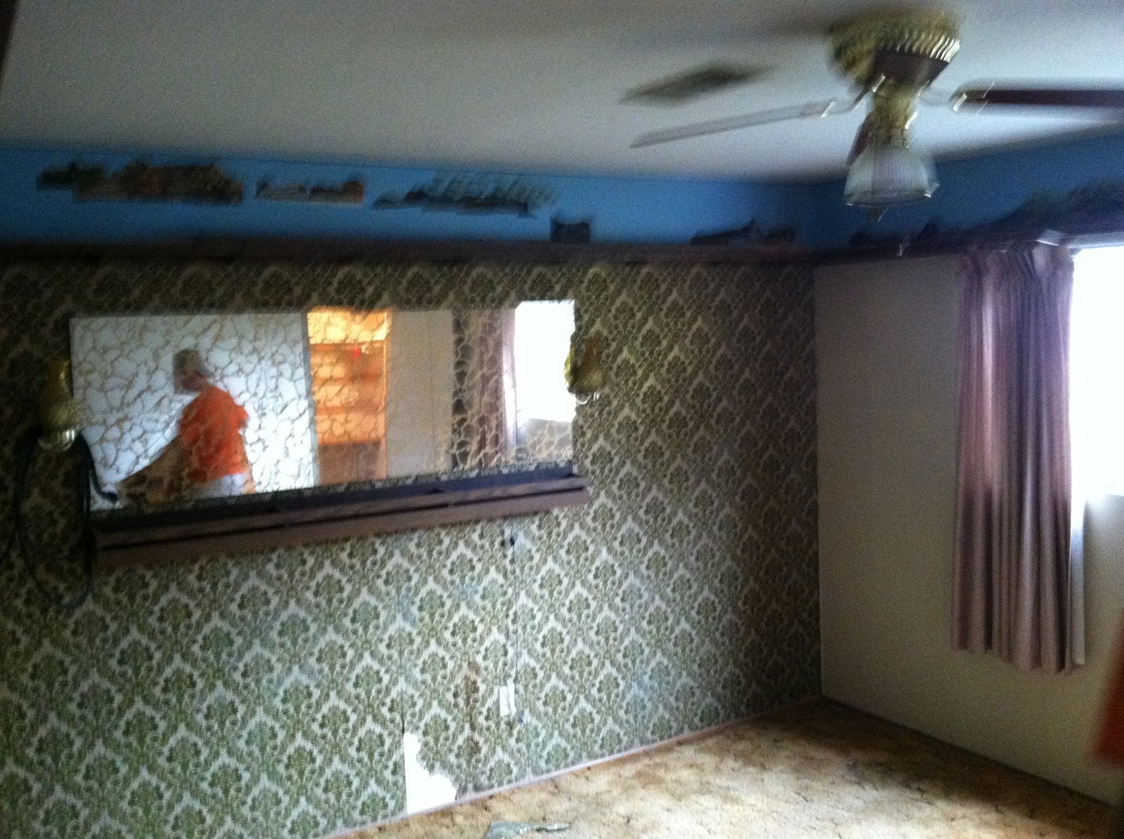
Working our way from ceiling to floor, it is a popcorn ceiling and then you start by seeing this 'lovely' blue border. It was 1/4" particle board with blue wall paper that was attached to the wall to add a scene to the brown shelf just below it where a train ran around the room. 

Yes, I know what you are thinking. Oh how cute for a little boys room. No, this was the office and not a child's room in the house. What you will also notice is a few other things. 1. Lots of random cables and wires running every which way. 2. Two strange pieces of balsa wood attached to the door (covered up a hole by previous owner- this was their 'fix'). 3. Access doors to plumbing- it is the little door on the left hand side. 


Here is the other wall- which got even better. I know your thinking- really it gets better?!

The photo above is contains an eclectic color palate with pink curtains, velvet green wall paper, the blue scenery, mirrored wall, with groovy green lights. 

 Here is a photo from two days ago- trying to remove the wall paper. It looks a ton brighter in this room with out the brown train shelf. And the carpet and security bars on the windows are gone. Removing the security bars turned out to be quite the hassle. They are installed with one way screws. So you need a special tool to remove them. We didn't like the look and frankly I would have died in a fire if I had to get out a window with these devices. There is a safety release but could never get it to work for me. We are thinking about doing stained concrete but can't decide on the finished look. Let me know if you anyone has any advice on stained concrete.
Next week I will show more in progress photos......... To Be Continued!


Friday, June 8, 2012

We got keys today on our house!

Projects are starting tomorrow. Oh, and as a little advice. Prior to starting any projects on your house, highly advise not to get yourself injured. I took a little spill on my bike while riding with a group last weekend. I think in the doctor's visit- I was asked, "are you trying to get out of moving and our construction project?" As if it was that easy......

We decided to work on the space we will use the most- the inside. Our plan is to remove the window and door bars from the outside. Scrap up the smelly old carpets, have a cleaning crew disinfect the place as it stinks like dog.

Then in about a week, repaint. Repaint the inside something calm and soothing. We are looking at gray tones with blues mixed in. The current colors are dark green and reds- it is simply too much for the size of the space. It has a dark cavernous feeling, so we hope to change that by adding some more light and using brighter lighter shades of subdued color.


Love the light blue color in this room, but our floors are darker. Eventually they will be a stained concrete.
gasl_fabricpalette_06mar_02


This is the color of the floor in our living and kitchen space- imagine the walls a light blue gray shade.
4-coastal-chic-foyer-kitchen-dec0707_xlg


Thursday, May 31, 2012

Keeping your chi


Interesting article I found. It makes you think about design in a different way especially if you are ever designing for an asian client. 


I worked on this project in the middle east, while leaving in New York. The project was a new college called the American University in Afghanistan. And it turns out that toilets and urinals can not face toward mecca. So this caused us to redesign the floor plans. Our next question was which direction is mecca?


So designing to cultural sensitivities is important to keep in mind. 


Excerpted from the ocregister.com:
Ms. Feng Shui walks into a model home in Irvine and glances around the room.
“You want the front door to be solid, not glass,” she says, eyeing the position and color of the door, examining the stairs, checking out the bathroom and inspecting the picture frames.
A window in the front door, “it’s like a hole in your mouth,” she says.
Front doors should be blue (for water) or black (representing career).  And it should never be in alignment with the back door because “all the energy goes out the back.”
Stairs should turn sideways to the front, also to keep the home’s energy from rushing outside. A home’s energy, or chi, should linger.
“A home should be a place where you recharge,” she says. “It should be restful.”
Ms. Feng Shui — a.k.a., Hyun Jung “Jessie” Kim of Lake Forest – doesn’t just advise homeowners. Lately, she’s been hired by KB Home to advise its designers on two upcoming developments, Sage at Portola Springs and Garden Hill at Portola Springs.
Many of feng shui’s values are common sense.
For example, both Wong and Kim noted that it’s bad feng shui to place homes at the top of a T intersection, with car lights flooding into a home’s front windows. But that’s just plain bad from any standpoint.  Red front doors reflect bad energy for homes at the end of a road or alley that form a T intersection.
Other things are not so obvious.
Kim explained that the sink and the stove top in the kitchen can’t be aligned because water and fire shouldn’t be together.
Also, you don’t want family pictures framed in metal in the family area of the home because metal cuts wood.  “That’s considered the destructive cycle,” she explained.
Ceiling fans above beds are bad because they deflect energy away from you, she said.
Feng shui devotees like the number eight in an address – or numbers that add up to eight – because the word for eight sounds like “wealth” in Chinese and is good for money.
If a home has an unlucky address, the address can be “changed” by adding a hidden number or painting an invisible number on the wall using clear paint or the same color paint.
If an address can’t be changed, Wong advises builders to put a less popular model on that lot, saving the most popular models for lots with favorable addresses. It’s likely the lot with the unpopular address will sell to a non-Asian buyer “who doesn’t know it’s a bad number,” she said.

Monday, May 21, 2012

While I love texture, this just isn't working.

 The first image was from our house hunting trips a few weeks ago now. This house had a dark brown clay tiled roof, 2x2 white wall tile on the eaves and 12x12 white tile around the baseboard of the house. It had too much variety with the texture and lines all working in many ways against each other. So there is too much of good thing for sure going on.
This next photo was from an entirely different house. We had labeled this the adult party house- with its pool room, full bar, oddly arranged kitchen and rooms with multiple doors. There were a number of things wrong with this house. (Earlier that day we had visited the college student party house so this was the adult version.) But for whatever reason I took this photo of the river rock detailing. A person could successfully use river rock but your design should be cohesive but also not excessive like what we saw with the too much texture post below. The river rock cabin feel could have been brought in with some rough sawn timbers used in the ceiling or some detail wood working here and there. What a strikes you? Leave comments below.

Friday, May 11, 2012

How MUCH? & fugly


This was a conversation that we have been having as we realize our house project is going to need some work. We are closing on our home in less than 30 days from today so the clock has started ticking. 

So now we need to figure out what tools we want to use, get finalized estimates for work, and get all that work scheduled that needs to be done before we move into our new home which is less than 45 days from today. We have 14 days of a window for some of the construction work to get done.

I think we are anxious to get started but also need a little distraction from the house for a bit. So I decided to do a google search on google for 'bad architecture.' Here are a few of the eye sores I found. Which one is your favorite of the worst?

Option 1: three tall, colorful men

Option 2: concrete monster

Option 3:  deviled egg
(Option 1)
The Mr. Fu, Mr. Lu, and Mr. Shou Hotel…is about 40 min east of Beijing, close enough to be considered the suburbs. It is situated in the rear of a concrete housing development, which are situated beside two active nuclear turbines. The building itself is constructed of concrete and colored tile. It is a hotel, and you can rent the room that looks like the jack-o-lantern!”  (direct quote from http://www.christopherdgray.co.uk/2004/09/badjianzhu-bad-architecture-beijing/)

(Option 2)The concrete monster initially looks to be a jail or some sort of institution. Well, it turns out to be the Nate Holden Performing Arts Center on 4718 W. Washington Blvd....... some things are not what you expect them to be. 

(Option 3) The Indian Pavilion and Saudi Arabia Pavilion at the Shanghai World Expo 2010

I heard a new term today for bad architecture: fugly. My vote is for option 3 is the best of the worst. Now I can only guess as to much money was spent on these projects. Unfortunately this was a bad investment in my mind. 

Wednesday, May 2, 2012

Things we see and things we don't see

Thanks for everyone's previous posts on what to do. It was really fun to see people voting on what they suggest for us to change, thanks again for the feedback. I will keep the poll open for another few weeks. While I begin developing a plan. 

Here is our update, we are in escrow with our house and the inspection was done this week. We had forgotten what the house looked like on the inside. We weren't necessary excited about the house's outside appearance but what I had kept telling myself is that the inside didn't need much work. I know we can fix the outside but I just hadn't been prepared for all the work the inside needed as well. 

Read the sign above the realtor's sign

So when we saw the property again, there were some surprises. On the day of the showing of this home, the first time we saw it, we had seen 9 other properties. So some of the details of the various houses blended together and others details were forgotten. As we walked through the home during the inspection we became reacquainted with it.

We are closing on the home in about a month so in the meantime we are busy collecting pricing for things to fix that were found in the inspection and for our own desired upgrades. 

Plastic window fire wall, is a bad idea. 
One of the items was replacing and filling the plastic window in the photo above for safety purposes. Most fires start in the garage and since more flammable liquids (gas, paints, ect...) are stored there that fire can grow quickly. You want to make sure your home has a properly sealed fire barrier between you and your garage. These means solid wood or metal doors, no exposed wood in the framed wall; which you essentially want is a gypsum board (sheetrock) wall that is continuous from the floor to the ceiling. It could easily save your life by buying you extra time to get out of your home safely.

The inspection report had a lot of the typical items, but also had more critical items. These items are safety issues: fire walls, haphazard and exposed wiring, and ill-conceived projects and of course the plastic window as noted above. 

What do we do we really see the TV or fireplace?
What I have been realizing is we don't often see everything that is there. When we saw the home we have an offer in on it was filled with the home owner's possessions and the home owner was home. These two components can be awkward because you are trying to truly see the home around all the stuff and not relay to the home owner your interpretation of the their home's aesthetics. Because let's face it home's are personal; they are a personal reflection of how we live, what is important to us, and where we spend our energy. In the photo above, my husband was appalled by this home owner's taste in the location of the TV, while to me it just made me smile.
This is a really cool item for a TV, the glass is transparent when not in use and simply goes away. This is designed by Michael Friebe which combines LCD with TOLED display. 


Friday, April 27, 2012

Reasons to hire an architect: We found a home!

Reasons to hire an architect: We found a home!: Here is the home we selected to purchase and finally a seller agreed to accept our offer. The home is 3 bedroom and 2 bathroom home with a...

We found a home!

Here is the home we selected to purchase and finally a seller agreed to accept our offer. The home is 3 bedroom and 2 bathroom home with a 2 car garage. It is a simple ranch style built on concrete slab in the 1960s. At first glance this house is not very charming. What the house does have is a huge lot and  a good layout that we can work with.

The outside is lacking in appeal; I think this is the reason my husband and I aren't necessary very excited as we look at the pictures of our new home. But what we do have is the ability to transform this ranch style home into something else. I can't wait to take possession to start the transformation. Now we are faced with the question and a need for a plan. Hmmmmm, where do we start? Where do you think we should start?


Leave a comment below on where you think we should start on the house.

  1. Paint?- what color?
  2. New Garage door or clad it?
  3. Shutters, remove, paint?
  4. Fascia  (it is the undulating trim board hanging from the roof edge) Remove?
  5. Remove the two tone rockscaping?
  6. Roof- new color, different type of roofing?
  7. Bars- Remove?
landscaping and porch?

modern ranch or....

vintage ranch style?